JK Alimentação Inclusiva | Rebranding
[PT/BR]
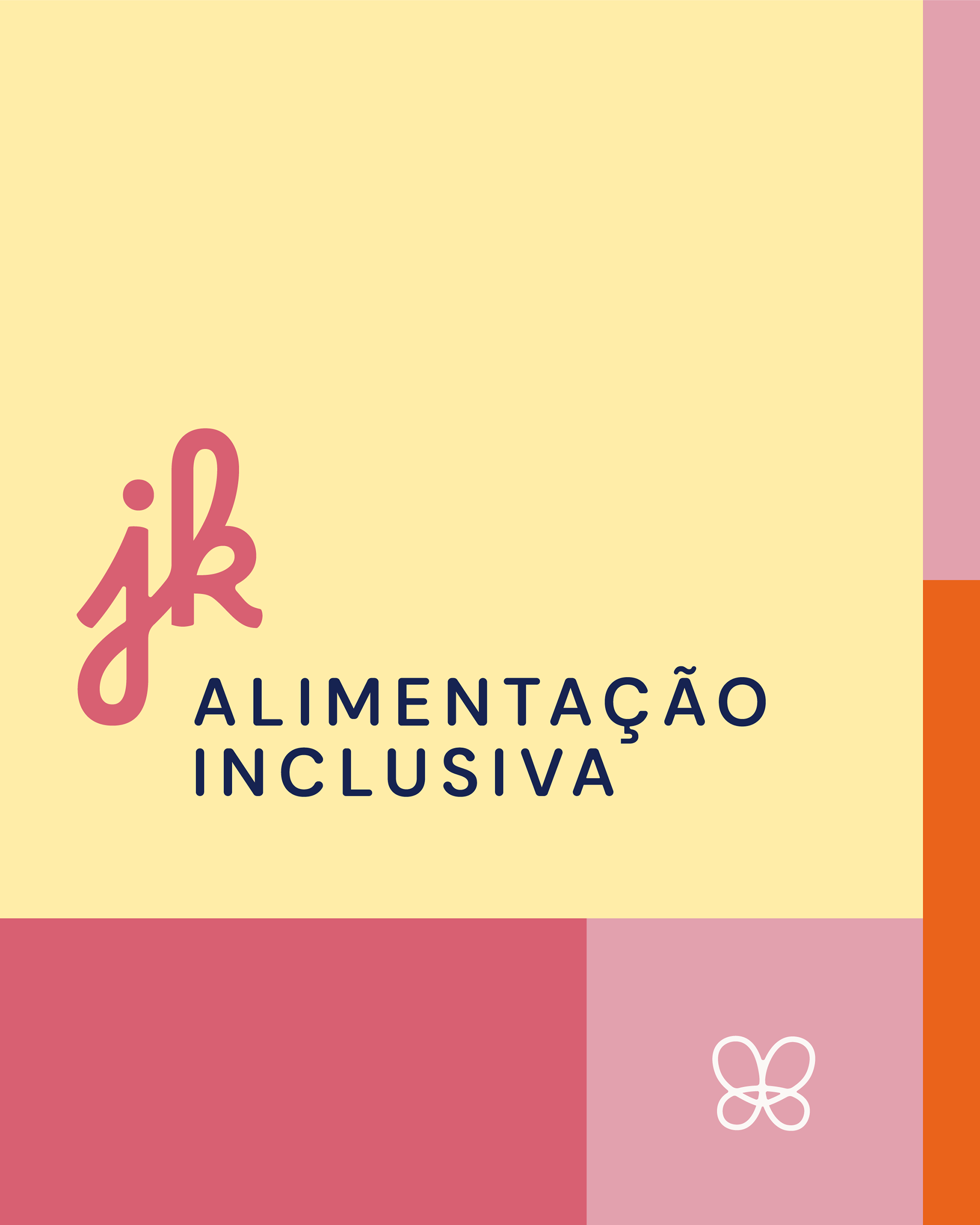
A nova identidade da JK Alimentação Inclusiva marca o início de uma fase mais estruturada, consciente e emocionalmente conectada da marca com seu público.
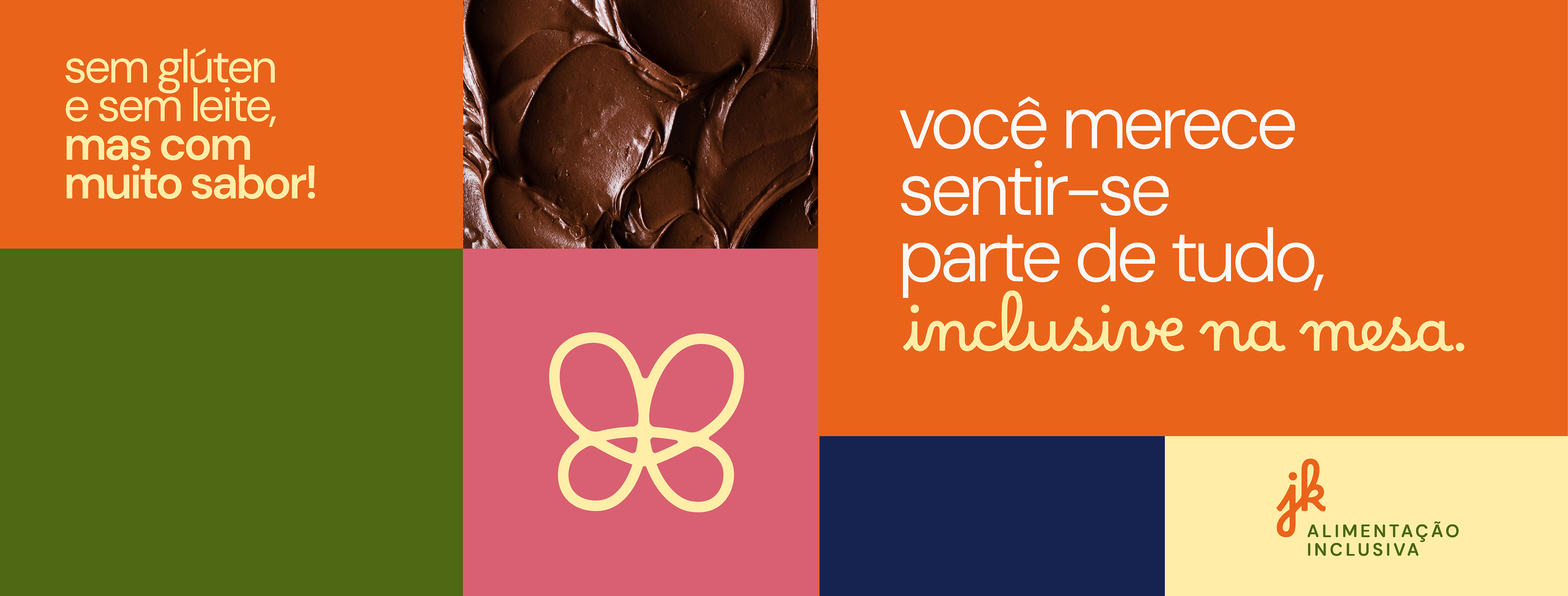
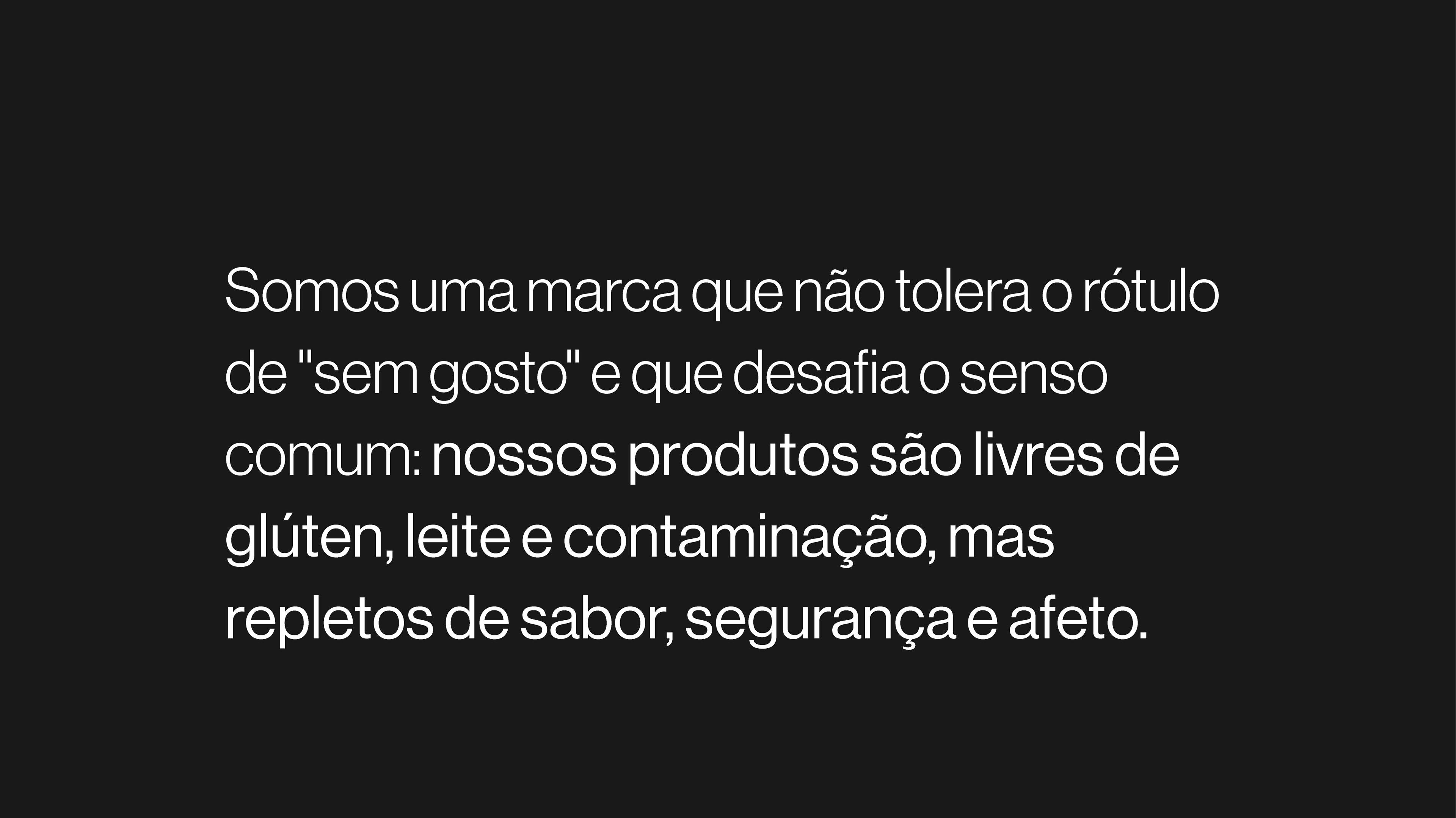
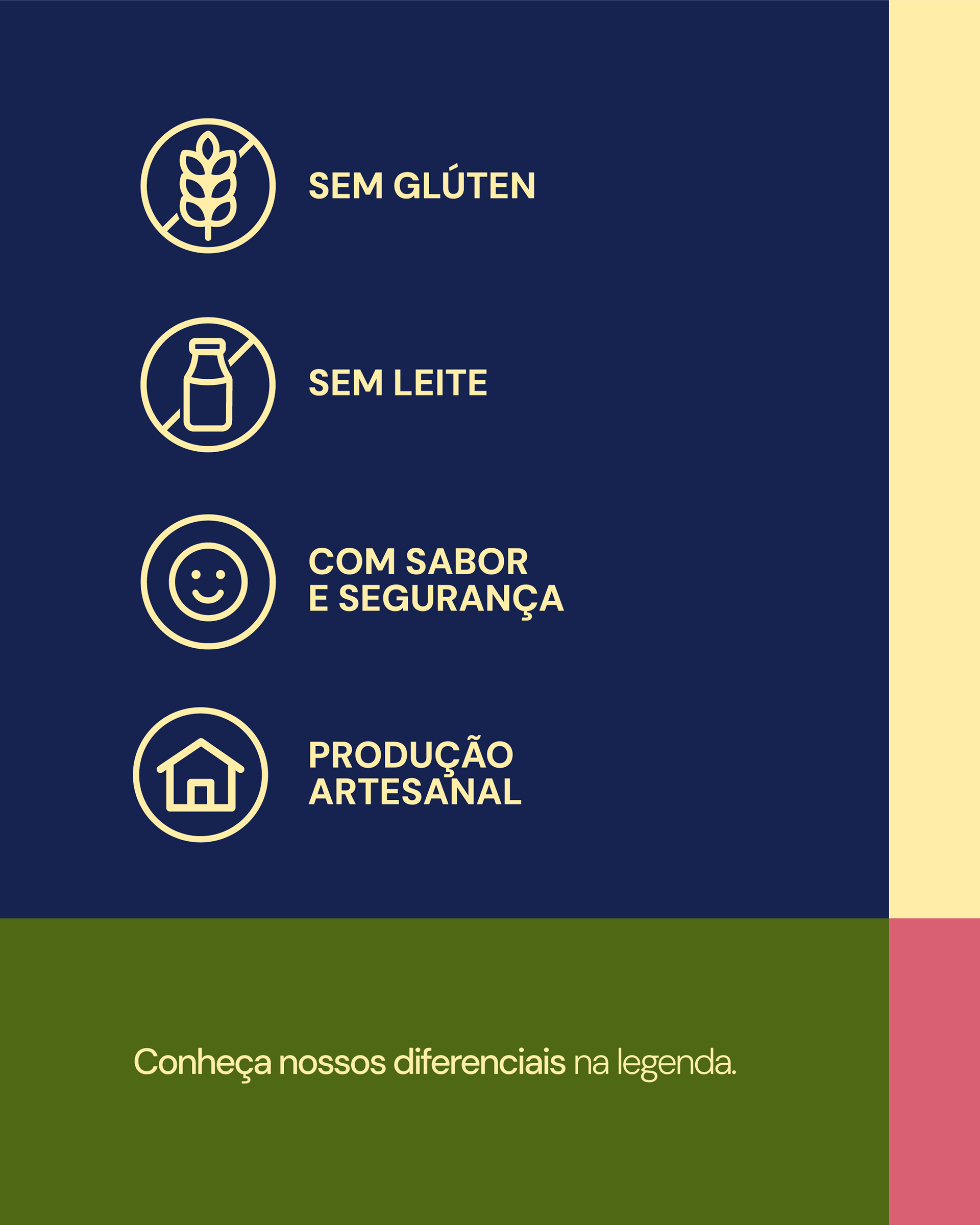
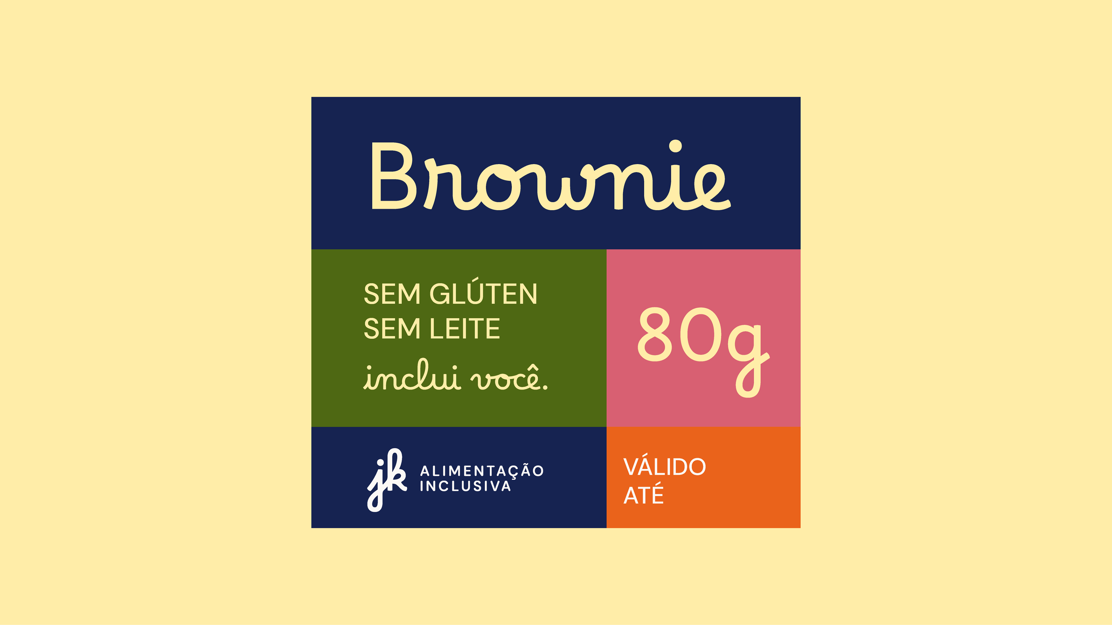
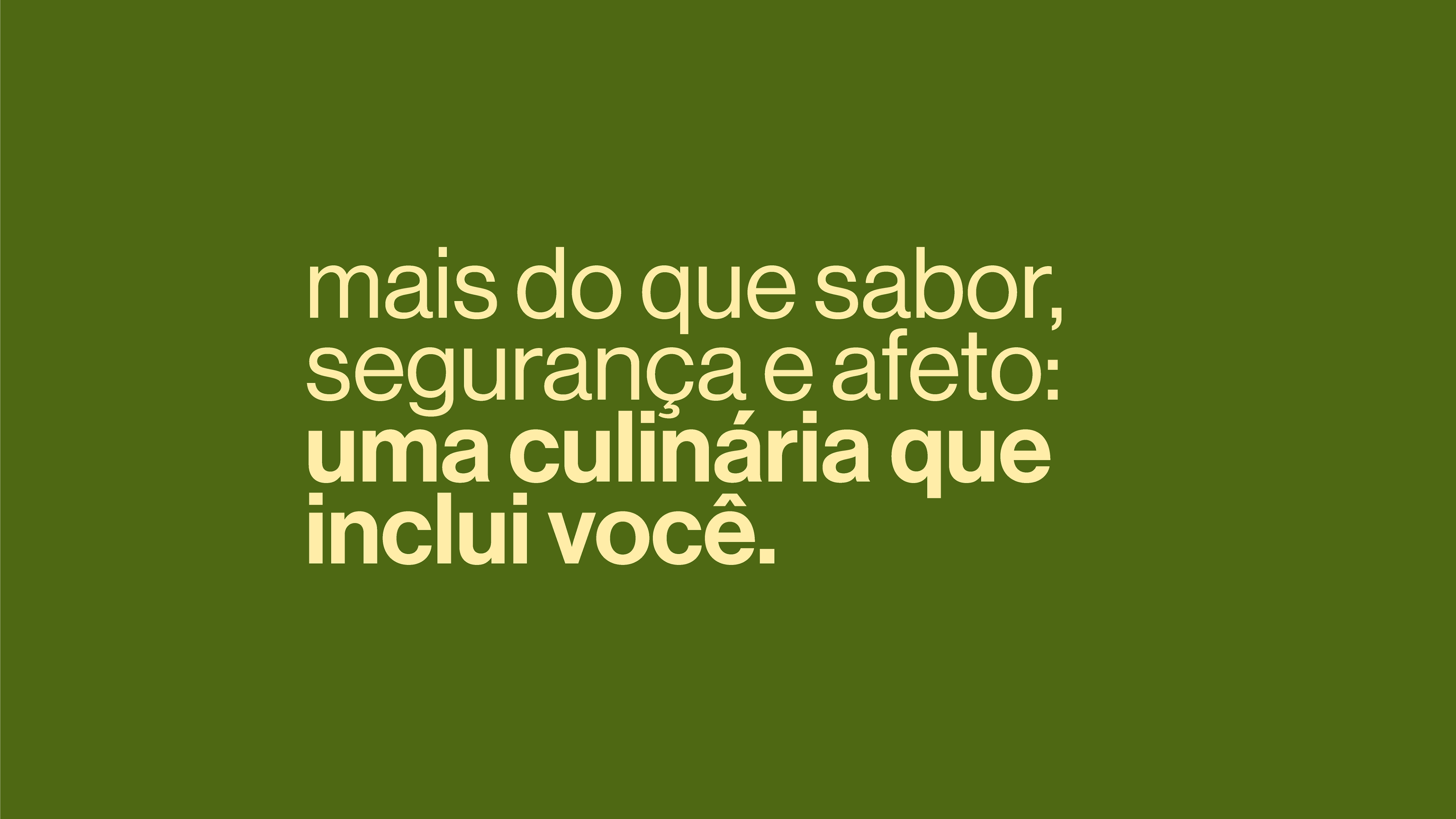
Com raízes em uma história pessoal e sensível, a JK agora se reposiciona com mais clareza como uma referência em alimentação segura, sem glúten e sem leite, acolhendo com sabor e propósito quem muitas vezes se sente excluído à mesa.
A proposta visual atualiza o que já era verdadeiro desde o início: que afeto, inclusão e profissionalismo podem e devem andar juntos na construção de uma marca com impacto social e relevância afetiva.
[EN]
The new identity of JK Inclusive Nutrition marks the beginning of a more structured, conscious, and emotionally connected phase between the brand and its audience.
Rooted in a personal and heartfelt story, JK now repositions itself more clearly as a reference in safe, gluten-free and dairy-free food, embracing with flavor and purpose those who often feel excluded at the table.
The visual proposal updates what has been true since the beginning: that affection, inclusion, and professionalism can - and must - go hand in hand in building a brand with social impact and emotional relevance.
[PT/BR]
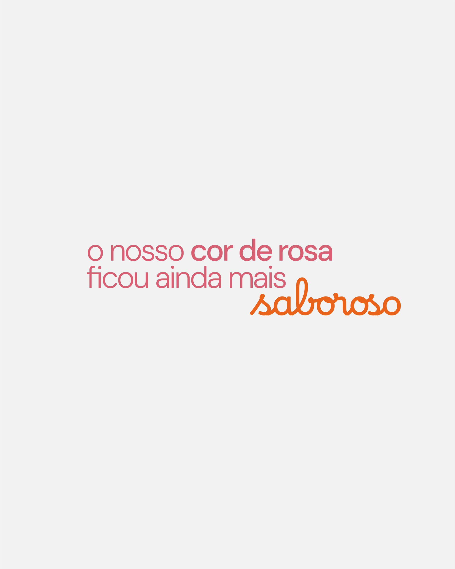
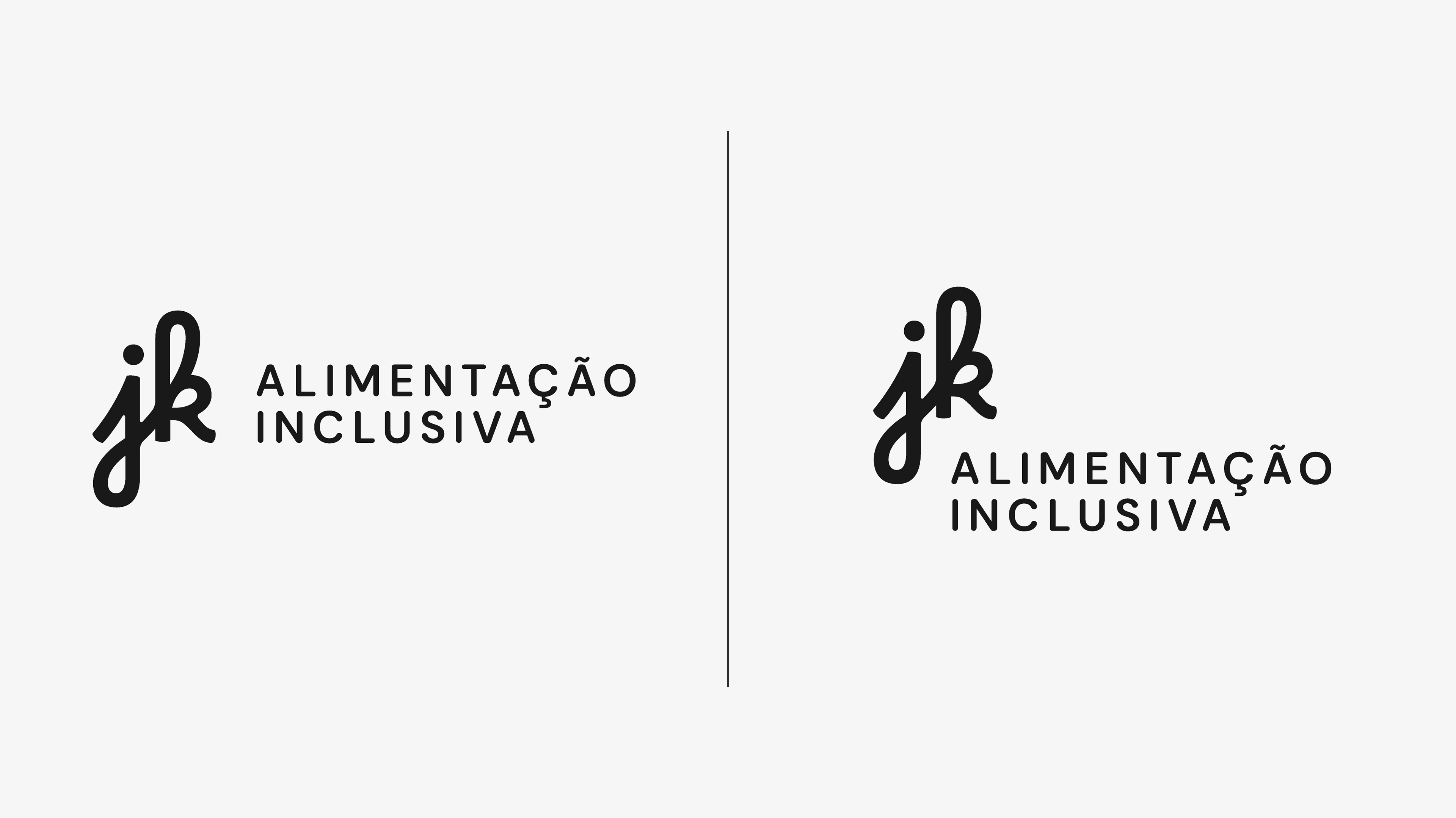
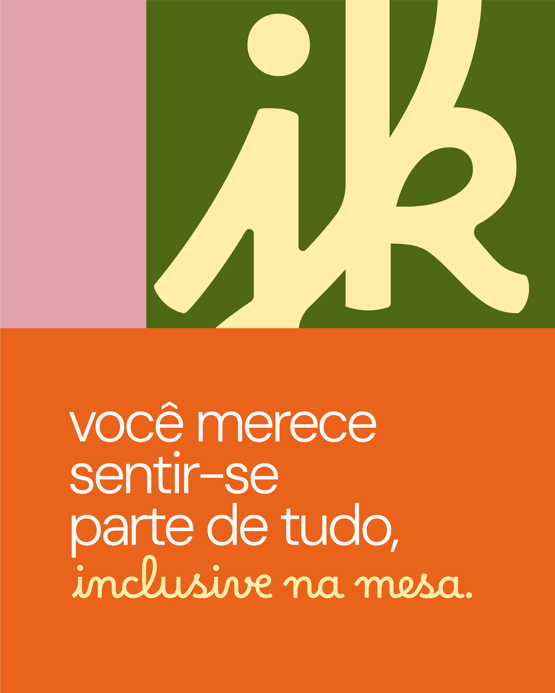
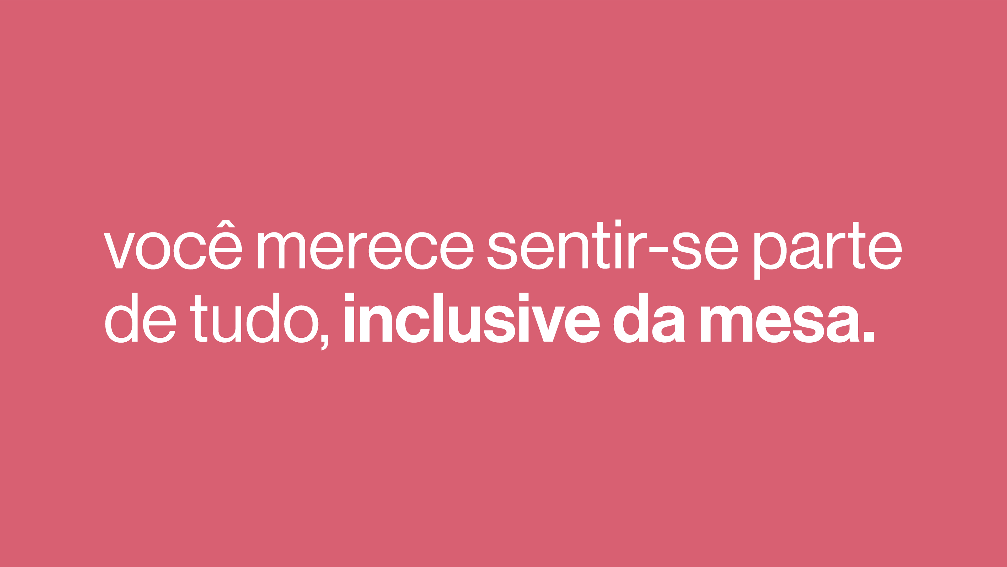
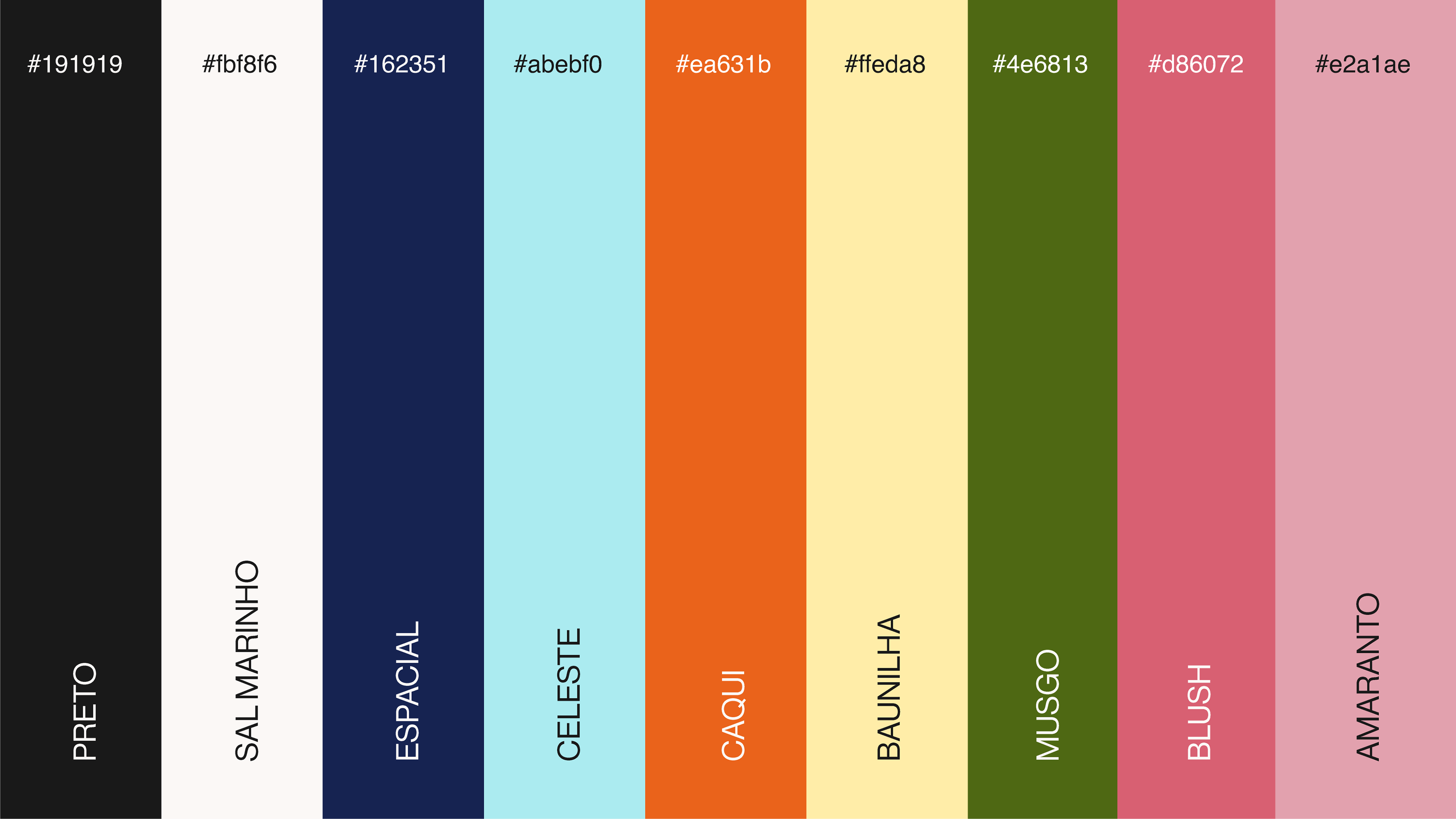
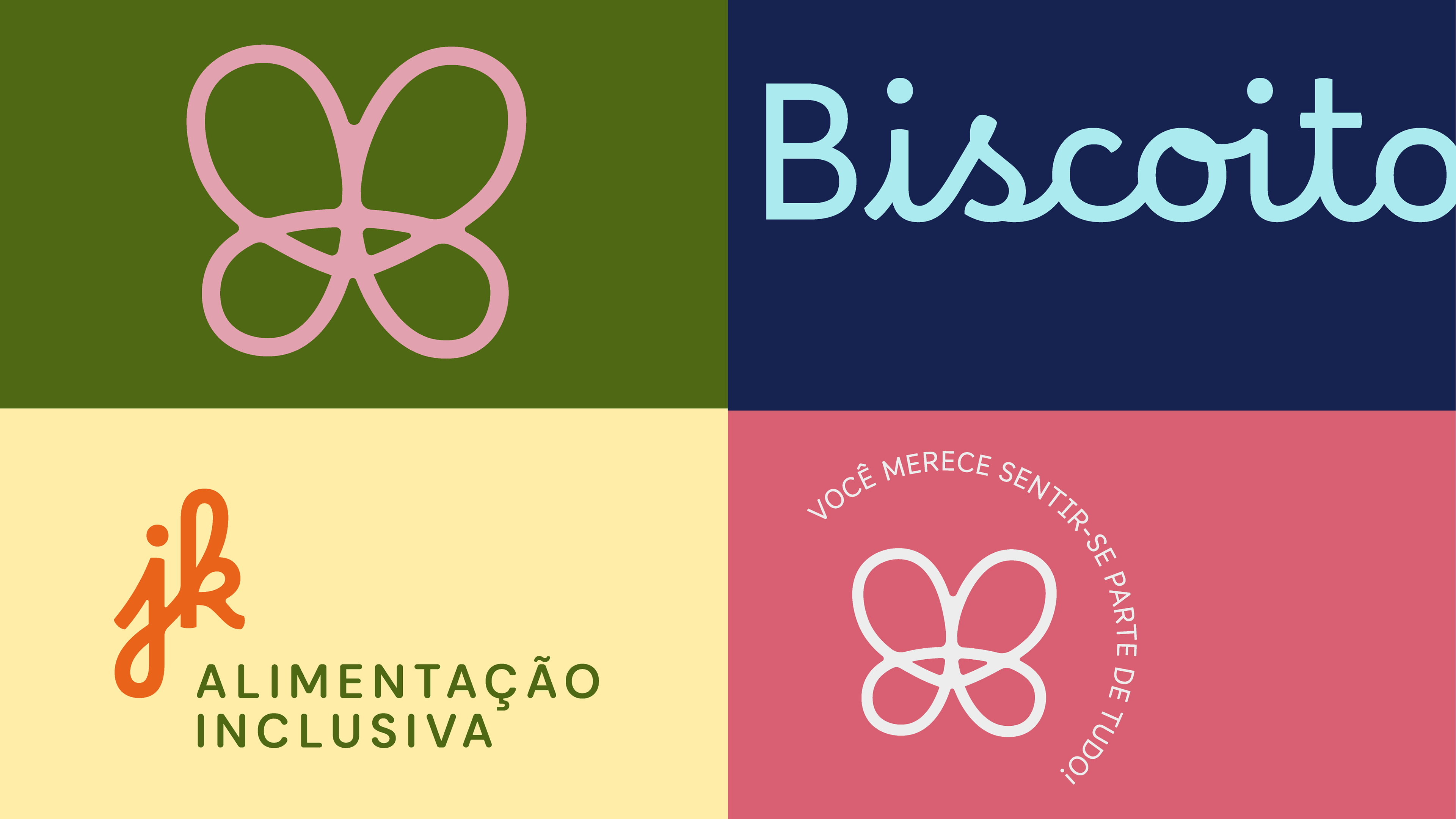
O novo posicionamento da JK traduz visualmente a missão que sempre esteve no coração do negócio: incluir, cuidar e oferecer alimentos seguros com sabor e acolhimento. A marca se afasta de estéticas genéricas ou caricaturais e ganha maturidade com uma identidade que equilibra neutralidade e sensibilidade, sob tons suaves como o rosa envelhecido - e vivos, como os azuis e verdes.
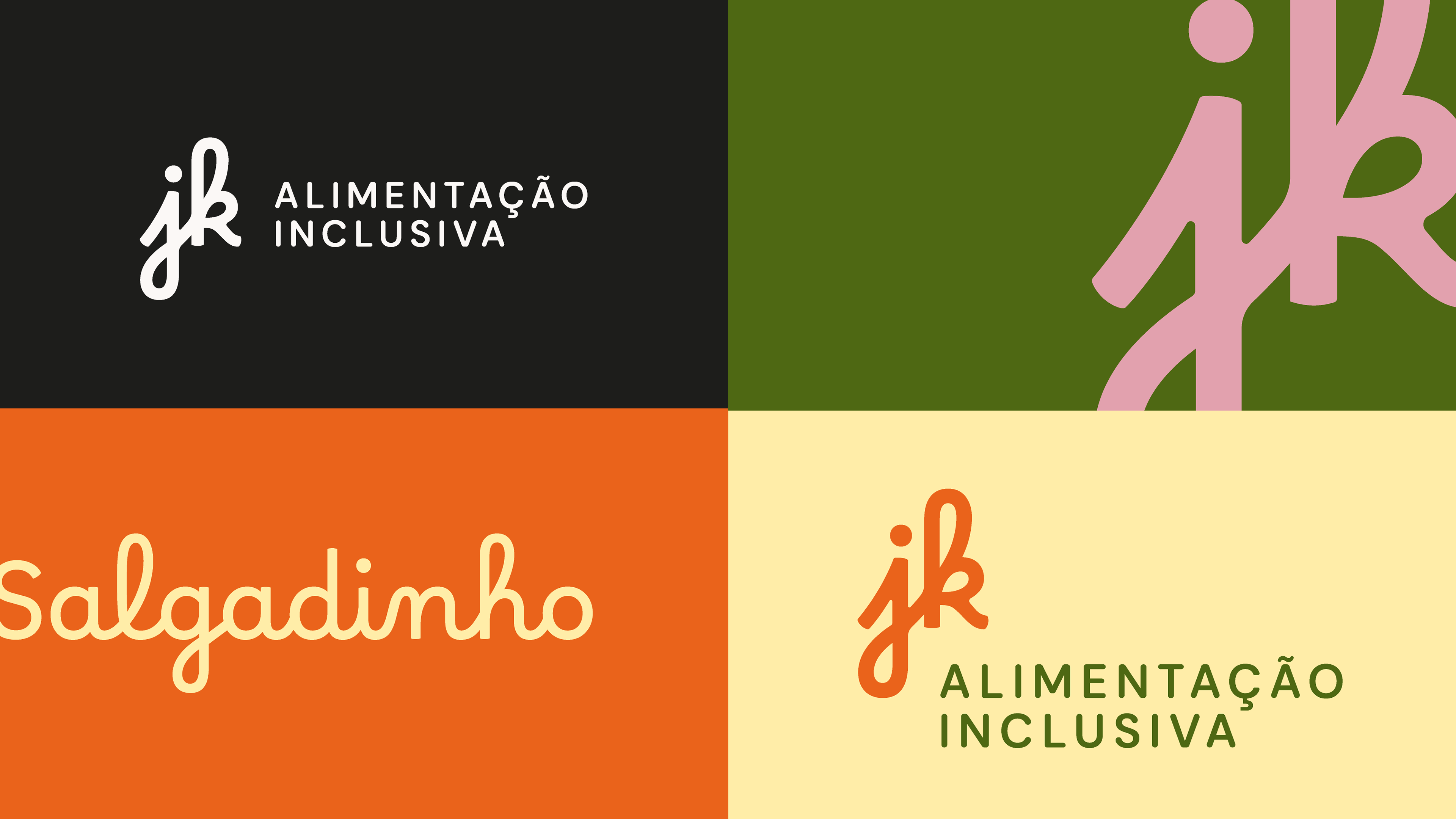
O símbolo e a tipografia foram desenvolvidos para transmitir confiança, afeto e profissionalismo, tornando a JK uma marca que conversa com mães, crianças, jovens e adultos que buscam na alimentação uma experiência de pertencimento.
[EN]
JK’s new positioning visually expresses the mission that has always been at the heart of the business: to include, care for, and offer safe food with taste and warmth. The brand distances itself from generic or caricatured aesthetics and gains maturity through an identity that balances neutrality and sensitivity, expressed in soft tones such as vintage pink.
The symbol and typography were developed to convey trust, affection, and professionalism, making JK a brand that resonates with mothers, children, youth, and adults who seek a sense of belonging through food.

[PT/BR]
Para a Norte Alta, desenvolver a nova identidade da JK foi um processo profundamente colaborativo e significativo. Trabalhar com um negócio tão enraizado em propósito, verdade e impacto real nos fez repensar a forma como o design pode ser ferramenta de inclusão.
A escuta ativa da fundadora, aliada à clareza emocional do projeto, nos permitiu criar uma identidade sensível, mas firme — com grande aplicabilidade e força de marca. Sentimos orgulho de contribuir com um reposicionamento que vai além da estética: ele representa a evolução de uma missão viva e afetiva, que agora se comunica com mais potência, sem perder sua essência.
[EN]
For Norte Alta, developing JK’s new identity was a deeply collaborative and meaningful process. Working with a business so deeply rooted in purpose, truth, and real impact led us to rethink how design can serve as a tool for inclusion.
The founder’s active listening, combined with the project’s emotional clarity, allowed us to craft an identity that is both sensitive and strong—with great applicability and brand strength. We are proud to contribute to a repositioning that goes beyond aesthetics: it represents the evolution of a living and emotional mission, now communicated with greater power without losing its essence.